Your bedroom needs color but pink feels too sweet and purple too bold. Mauve occupies that perfect middle ground—a dusty purple-gray hybrid measuring around 300-320 on the color spectrum between pure purple (280) and pink (350). You want sophisticated depth without overly feminine or dark results.
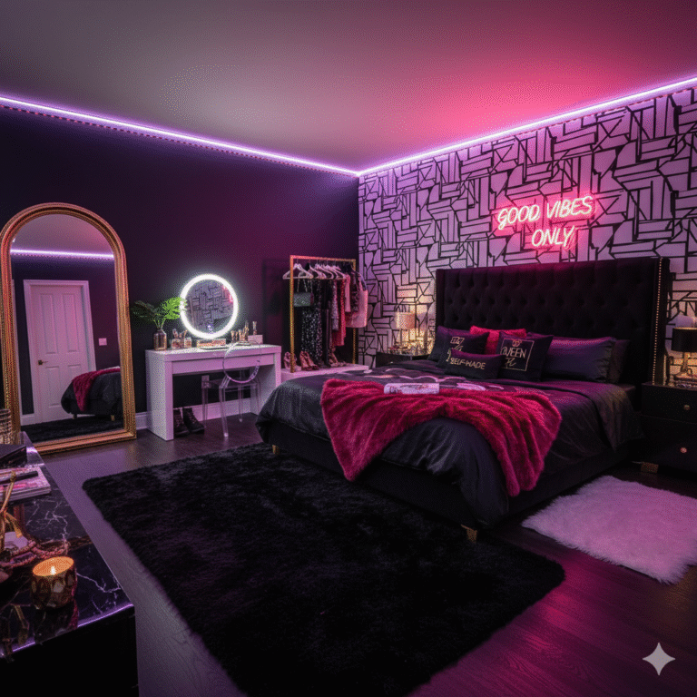
Moody mauve bedrooms deliver grown-up romance with unexpected edge when layered thoughtfully. I’m covering 13 nuanced approaches from dusty mauve accent walls and plum textiles to charcoal pairings and metallic accents.
You’ll see which mauve shades feel modern, how to prevent sweet bedroom clichés, what mistakes make mauve look washed out, and approaches balancing softness with moody sophistication.
Why Moody Mauve Bedrooms Work Beautifully
Color Psychology Promotes Calm: Mauve combines purple’s meditative qualities with gray’s neutrality creating naturally calming environments. The muted tone reduces visual stimulation supporting better sleep quality compared to saturated colors.
Gender-Neutral Appeal Increases: Unlike bright pink or deep purple, mauve reads sophisticated and balanced. The gray undertones prevent overly feminine associations making spaces feel elegant rather than girlish.
Timeless Sophistication Endures: Mauve’s complexity prevents trend-cycling like pure colors. The nuanced gray-purple ages gracefully in design spanning decades rather than feeling dated within years.
Versatility Spans Aesthetics: Moody mauve adapts to modern minimalist, vintage romantic, or eclectic bohemian styles. The sophisticated neutral works across design languages unlike polarizing statement colors.
Moody Mauve Bedroom Ideas That Balance Romance And Edge
Create sophisticated purple-toned retreats with these moody mauve bedroom ideas featuring layered complexity.
Dusty Mauve Accent Wall
Paint one wall in muted dusty mauve creating subtle focal points behind beds. The understated color adds depth without overwhelming like bold purples. It’s like twilight permanent where softness meets sophistication.
Sherwin Williams’ Beguiling Mauve or Benjamin Moore’s Sleepy Hollow deliver perfect dusty depth. Pair with lighter adjacent walls preventing cave-like darkness. This moody mauve bedroom foundation anchors designs with gentle drama.
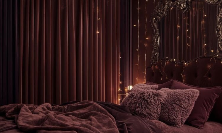
Plum And Gray Layered Bedding
Mix plum, mauve, dove gray, and charcoal bedding in varied textures creating tonal richness. The purple-gray gradient feels intentionally curated rather than accidental. It’s like storm clouds luxurious where depth builds gradually.
Combine velvet plum pillows, linen mauve duvet, smooth gray sheets, and chunky charcoal throws. Different textures prevent muddy sameness. This moody mauve bedroom layering technique builds sophisticated complexity.
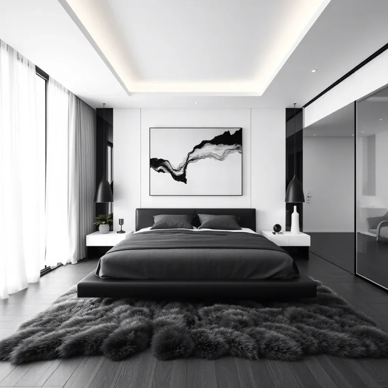
Charcoal And Mauve Contrast
Pair deep charcoal furniture or accent walls with soft mauve textiles creating dramatic sophisticated contrast. The dark-light interplay adds edge preventing overly sweet results. It’s like yin-yang chromatic where opposites balance beautifully.
Charcoal bed frames, nightstands, or dressers ground airy mauve keeping spaces from floating ethereally. The combination feels modern and intentional. This moody mauve bedroom pairing adds necessary weight and drama.
Rose Gold Metallic Accents
Incorporate rose gold light fixtures, drawer pulls, or mirror frames adding warm metallic shimmer. The pinkish metal harmonizes naturally with mauve’s undertones while adding luxury. It’s like jewelry architectural where metals enhance softness.
Brushed rose gold feels more sophisticated than shiny finishes. Layer with brass or copper for varied warmth. This moody mauve bedroom metallic addition brings essential glamour without coldness.
Eggplant Velvet Upholstery
Add deeper eggplant velvet headboards, chairs, or ottomans providing richer purple anchors. The darker tone grounds lighter mauves preventing washed-out feelings. It’s like shadows dimensional where depth varies strategically.
Velvet’s texture catches light beautifully creating movement and interest. Choose tufted or channel designs adding architectural dimension. This moody mauve bedroom anchor prevents pale flatness effectively.
Sage Green Natural Balance
Introduce sage green plants, pillows, or artwork creating natural color harmony. Green and purple’s complementary relationship feels instinctively balanced and fresh. It’s like gardens indoors where nature’s palette perfects.
Use sage sparingly—15-20% of scheme—allowing mauve to dominate. The green prevents purple from feeling too monochromatic or heavy. This moody mauve bedroom addition brings essential freshness and life.
Warm White Trim Brightening
Paint trim, molding, and ceilings warm white creating crisp contrast against mauve walls. The clean edges define spaces while preventing muddiness. It’s like picture frames built-in where definition matters.
Avoid cool stark whites clashing with warm mauve undertones. Benjamin Moore’s Simply White or Sherwin Williams’ Alabaster offer warm neutrality. This moody mauve bedroom contrast adds necessary crispness and light.
Blush And Mauve Gradient
Layer blush pink with mauve creating soft ombré effects in textiles or wall treatments. The tonal gradient feels romantic without saccharine sweetness. It’s like sunset bedrooms where colors fade beautifully.
Start with deeper mauve at bottom transitioning to soft blush at top in curtains or bedding. The gradient adds visual interest preventing flat color blocks. This moody mauve bedroom technique creates gentle sophisticated movement.
Black Matte Accents Grounding
Add matte black picture frames, hardware, or light fixtures providing sharp sophisticated contrast. The darkness prevents mauve from feeling too soft or undefined. It’s like eyeliner architectural where black sharpens beautifully.
Matte finishes feel more modern than glossy black avoiding harsh reflections. Use black sparingly—10-15% maximum—for impact without overwhelming. This moody mauve bedroom edge adds contemporary sophistication.
Textured Mauve Wallpaper
Install grasscloth, linen-textured, or subtly patterned mauve wallpaper adding dimensional interest. The texture prevents flat color-block feeling creating depth. It’s like fabric walls where dimension transforms surfaces.
Choose wallpapers with slight sheen variations catching light throughout day. Removable options work perfectly for renters experimenting. This moody mauve bedroom backdrop adds sophisticated texture effortlessly.
Cream And Ivory Softening
Balance mauve with cream bedding, ivory rugs, or off-white curtains preventing overwhelming purple. The warm neutrals lighten spaces while harmonizing with mauve’s undertones. It’s like breathing room chromatic where lightness balances color.
Keep 40-50% of room in light neutrals with mauve as remaining percentage. Pure white feels too stark but cream complements beautifully. This moody mauve bedroom balance prevents color overload effectively.
Amethyst Crystal Decor
Display amethyst geodes, crystal clusters, or purple agate slices as decorative objects enhancing color story. The natural stones add organic purple tones and texture. It’s like geology decorative where nature inspires design.
Group crystals on nightstands, dressers, or shelves creating intentional vignettes. The natural variations in purple add depth and interest. This moody mauve bedroom detail brings literal earthiness and beauty.
Layered Purple-Gray Curtains
Hang floor-to-ceiling curtains in mauve, lilac, or purple-gray controlling light dramatically. The heavy fabric adds softness while providing essential light control. It’s like cocoons elegant where fabric envelops protectively.
Choose linen or velvet in complementary purple tones. Ceiling-mounted rods make rooms feel taller and more luxurious. This moody mauve bedroom window treatment completes sophisticated atmospheres beautifully.
Common Moody Mauve Bedroom Mistakes And Solutions
Using Too-Pale Mauve Washing Out
Extremely light mauve disappears looking more gray than purple lacking intended color impact.
Solution: Choose medium-toned mauves with visible purple presence. Test paint samples in room’s natural light ensuring color reads clearly. Sherwin Williams’ Beguiling Mauve or Farrow & Ball’s Brassica offer proper depth.
Skipping Darker Anchors Creating Floatiness
All-light mauve without deeper tones feels washed out and undefined lacking grounding weight.
Solution: Incorporate charcoal, eggplant, or black elements anchoring spaces. Dark furniture, accent pillows, or artwork prevents ethereal floating feelings. Balance light mauves with 20-30% darker elements providing necessary contrast.
Pairing With Cool Grays Clashing
Cool blue-grays clash with mauve’s warm purple undertones creating discordant muddy results.
Solution: Choose warm grays with taupe or greige undertones harmonizing with mauve. Avoid blue-grays or cool concrete tones. Test gray samples beside mauve ensuring undertones align creating cohesive palettes.
Overlooking Metallic Temperature
Silver or chrome metals feel cold against warm mauve creating uncomfortable visual discord.
Solution: Use warm metals—rose gold, brass, copper, or antique gold—complementing mauve’s warmth. Brushed finishes feel more sophisticated than high-shine polished versions. Consistent warm metallics create cohesive elegant atmospheres.
Insufficient Lighting Dulling Color
Mauve absorbs light so inadequate illumination makes rooms feel dim and color muddy.
Solution: Install multiple warm light sources—overhead plus bedside lamps plus accent lighting. Use 2700-3000K warm bulbs enhancing mauve’s warmth. Layer ambient, task, and mood lighting preventing flat dull appearances.
Frequently Asked Questions About Moody Mauve Bedrooms
What Exact Mauve Shades Work Best Bedrooms?
Medium-depth dusty mauves with visible purple presence work beautifully—not too pale washing out, not too dark overwhelming. Sherwin Williams’ Beguiling Mauve (SW 6269), Benjamin Moore’s Sleepy Hollow (2144-50), or Farrow & Ball’s Brassica (271) offer sophisticated depth.
These shades measure around 15-25% saturation providing color without overwhelming intensity.
How Do You Balance Mauve Without Looking Too Feminine?
Pair mauve with grounding elements—charcoal furniture, black matte accents, dark wood tones, or industrial metals—adding masculine edge.
Keep mauve to 50-60% of color scheme with darker anchors comprising 30-40%. Avoid ruffles, florals, or overly decorative patterns that skew feminine regardless of color choices.
Can You Mix Mauve With Other Colors Successfully?
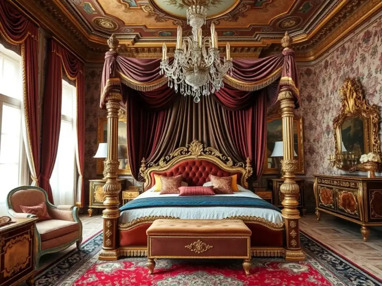
Absolutely—mauve pairs beautifully with sage green (complementary harmony), charcoal gray (dramatic contrast), cream and ivory (soft neutrality), blush pink (tonal gradient), or warm taupe (earthy sophistication).
Stick to three colors maximum beyond mauve preventing chaotic busy schemes. Earth tones and muted shades harmonize best while neon or primary colors clash harshly.
What Lighting Works Best Mauve Rooms?
Warm white 2700-3000K bulbs enhance mauve’s warmth and richness preventing muddy dull appearances.
Install minimum four light sources—overhead ambient, two bedside task lamps, and accent lighting like wall sconces or floor lamps. Mauve absorbs light so multiple sources prevent cave-like dimness.
Creating Your Moody Mauve Haven
Moody mauve bedroom ideas prove sophisticated purple-gray tones create romantic yet edgy retreats.
Layer various mauve depths with textures and metallics, balance softness with dark charcoal anchors, and incorporate warm lighting preventing muddy dullness. Avoid overly pale mauves or cool gray pairings creating washed-out clashing results instead of sophisticated depth.
Which moody mauve element resonates most? Share your purple-toned bedroom plans below!