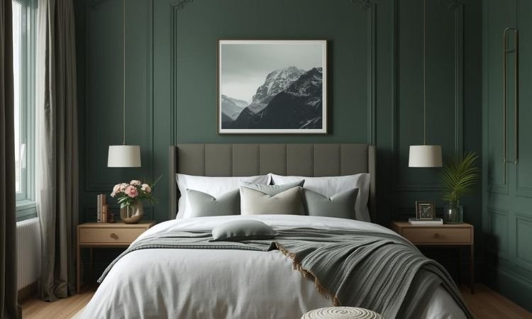
A moody green bedroom doesn’t just use paint—it layers tone, texture, and light to create a space that feels grounded and restful.
From forest and olive to sage and charcoal-green blends, these palettes avoid bright or yellow-leaning greens in favor of deep, complex hues with warm or neutral undertones. In a standard 12’x14′ (168 sq ft) room, the right green acts like a quiet forest at dusk: enveloping, peaceful, and deeply calming.
Forget lime or mint. True moody greens lean into earthiness—paired with warm neutrals, natural wood, and matte finishes. These 13 curated palettes focus on harmony, balance, and real-world application so your bedroom feels cohesive, not chaotic.
Why Moody Green Works for Sleep
Green reduces eye strain: Its mid-wavelength light is easiest for the human eye to process in low light.
Earthy tones support melatonin: Deep, warm greens signal calm to the nervous system.
Matte finishes prevent glare: Glossy walls reflect harshly; matte absorbs softly.
Natural pairing potential: Green harmonizes effortlessly with wood, linen, wool, and brass.
13 Moody Green Bedroom Color Palettes That Create Calm, Depth, and Earthy Serenity
All palettes work in rooms as small as 12’x12′ and assume daily use.
1. Forest Green + Oat + Walnut
Walls: Sherwin-Williams Evergreen Fog (matte)
Bedding: Oat-colored linen duvet and sheets
Wood: Solid walnut platform bed and nightstands
This palette mimics a shaded woodland—deep green walls feel protective, while oat bedding and warm wood add softness without contrast shock.
2. Olive Green + Cream + Blackened Steel
Walls: Benjamin Moore Saybrook Sage (matte)
Trim: Warm white (White Dove)
Furniture: Blackened steel bed frame with cream wool throw
Olive’s subtle gray undertone keeps the mood relaxed, while blackened steel adds industrial edge balanced by creamy textiles.
3. Charcoal Green + Charcoal + Brass
Walls: Farrow & Ball Green Smoke (matte)
Rug: Charcoal wool bouclé
Fixtures: Unlacquered brass sconces and hardware
This near-monochromatic scheme uses tonal variation—charcoal green walls, deeper charcoal rug, and warm brass accents—to create depth without color chaos.
4. Sage Green + White + Light Oak
Walls: Sherwin-Williams Retreat (matte)
Ceiling & Trim: Crisp white (Alabaster)
Flooring: Light oak hardwood or wood-look tile
A softer take on moody, this palette uses a muted sage that reads as deep in low light but fresh in daylight, paired with airy white and pale wood for balance.
5. Pine Green + Terracotta + Cream
Walls: Behr Balsam (matte)
Accents: Terracotta ceramic vessels, cream linen curtains
Textiles: Cream wool throw with rust lumbar pillow
The warm red undertone in terracotta complements pine green’s earthiness, creating a desert-meets-forest warmth that feels both cozy and grounded.
6. Deep Teal-Green + Oat + Walnut
Walls: Benjamin Moore Hunter Green (matte)
Bedding: Oat percale sheets and textured duvet
Wood: Walnut floating shelves and dresser
This green-leaning teal bridges blue and green, offering oceanic calm with forest depth, softened by oat and warm wood to prevent coolness.
7. Moss Green + Charcoal + Linen
Walls: Sherwin-Williams Studio Green (matte)
Rug: Charcoal flat-weave jute
Curtains: Heavy oat linen blackout panels
Moss green’s organic, slightly grayed tone pairs beautifully with charcoal and natural fiber, creating a minimalist yet tactile retreat.
8. Bottle Green + Cream + Black Iron
Walls: Farrow & Ball Hague Blue (note: despite name, reads as deep green in many lights)
Bed Frame: Matte black iron with simple lines
Textiles: Cream cotton blanket and oat lumbar pillow
This rich, almost-black green feels luxurious when paired with crisp cream and industrial black iron—ideal for small spaces needing depth without gloom.
9. Eucalyptus Green + White + Light Wood
Walls: Behr Eucalyptus Leaf (matte)
Trim: Bright white
Furniture: Light ash or birch nightstands
A cooler but still moody option, eucalyptus green feels spa-like when balanced with white trim and pale wood, perfect for humid climates or north-facing rooms.
10. Army Green + Oat + Leather
Walls: Sherwin-Williams Rookwood Dark Green (matte)
Accent: Cognac leather desk chair or bench
Bedding: Oat linen with charcoal throw
This utilitarian palette uses army green’s muted strength, softened by oat and warmed by leather for a masculine-but-refined feel.
11. Gray-Green + Gray + Brass
Walls: Benjamin Moore Gray Wisp (with green base)
Rug: Medium gray wool
Hardware: Unlacquered brass fixtures
When true green feels too bold, a gray-green offers subtlety. Paired with tonal grays and warm brass, it creates a sophisticated, modern-calm atmosphere.
12. Emerald Green + Cream + Walnut
Walls: Sherwin-Williams Artichoke (matte)
Bedding: Cream percale sheets and velvet duvet
Wood: Walnut headboard or side table
Emerald’s jewel-like richness feels opulent but not theatrical when grounded by cream and walnut—ideal for primary bedrooms with good natural light.
13. Blackened Green + Black + Oat
Walls: Benjamin Moore Dark Olive (matte)
Furniture: Matte black platform bed
Textiles: Oat wool throw and linen sheets
This near-black green creates a dramatic cocoon. The oat bedding provides essential soft contrast, while black furniture unifies the space without heaviness.
Common Mistakes and Fixes
- Using yellow-based greens
Fix: Avoid “lime,” “apple,” or “kelly” greens. Choose greens with gray, brown, or blue undertones for true moody depth. - Skipping lighting tests
Fix: Paint large swatches and view at dawn, noon, and night. Many greens shift dramatically under artificial light. - Pairing with cool whites
Fix: Use warm whites like White Dove or Alabaster, not cool ones like Chantilly Lace, which make green feel clinical. - Ignoring wood tones
Fix: Match wood warmth to your green: walnut with forest green, light oak with sage, ash with eucalyptus. - Over-accessorizing
Fix: Let the wall color lead. Limit decor to 5–6 key items—plants, art, textiles—and keep them in your core palette.
Let the Green Ground You
A moody green bedroom isn’t about trend—it’s about returning to nature’s quiet rhythm. Whether you choose forest, olive, or sage, the right shade wraps you in calm the moment you walk in.
Which palette speaks to you? Have you tried moody green in your bedroom? Share your favorite combo—or biggest lesson—in the comments.
We’d love to hear how you’ve brought earthy serenity into your sleep space.