Your living room walls probably need something but you keep avoiding the blue sections at stores because you’re scared of commitment, worried about wrong shades, unsure if blue works with your existing furniture, and basically paralyzed by all the navy-versus-teal-versus-sky-blue decisions that seem way more complicated than just sticking with safe boring beige you secretly hate but at least understand.
Blue wall decor living room styling isn’t about matching everything perfectly to some specific shade—it’s understanding how different blues create different moods, which undertones work with your lighting, how to layer various blue tones without looking like Smurf village, and mixing blue with other colors creating sophisticated collected spaces versus single-color monotony that feels flat and one-dimensional.
We’re covering blue wall decor living room ideas featuring navy drama, coastal calms, jewel-tone richness, and strategic mixing. You’ll discover which blues suit different room sizes and lighting conditions. We’re exploring artwork selections, textile combinations, and styling approaches. Plus practical tips for testing colors and building confidence with this versatile gorgeous color that deserves way more love than the beige monopoly currently happening in most living rooms.
Why Blue Works Beautifully in Living Rooms
- Blue Creates Instant Calm and Serenity: This color naturally lowers blood pressure and heart rate making spaces feel peaceful and relaxing. It’s like built-in stress relief through color psychology. The calming effect makes blue perfect for gathering spaces meant for unwinding and conversation.
- Versatility Spans Styles and Moods: From crisp nautical to moody dramatic, traditional to contemporary, blue adapts to any aesthetic. It’s like a design chameleon changing personality through shade selection. The range from pale sky to deep navy means blue suits virtually any style preference.
- Timelessness Transcends Temporary Trends: Blue remains classic and elegant never dating like trendy colors that scream specific eras or moments. It’s like investment pieces versus fast fashion where quality endures. The enduring appeal protects decorating investments from looking obviously dated within years.
- Natural Light Interaction Creates Magic: Blue changes beautifully throughout day as natural light shifts creating dynamic living environments. It’s like having multiple rooms in one where changing light transforms appearance. The light sensitivity adds depth and interest flat static colors can’t provide.
Blue Wall Decor Living Room Ideas
Create serene sophisticated spaces with these blue wall decor living room ideas featuring varied approaches and tonal strategies.
Navy Accent Wall with Gold Accents
Paint one focal wall deep navy creating dramatic backdrop for gold-framed mirrors, artwork, or metallic accents. The rich saturated color adds depth and sophistication impossible with lighter shades. Navy provides elegant contrast making gold brass copper accents pop dramatically. Choose wall behind sofa or fireplace for maximum impact.
Style with varied gold tones—brushed brass, antique gold, warm metallics—creating layered luxurious appearance. Include cream or white furniture preventing space feeling too dark or heavy. The bold navy requires commitment but delivers stunning sophisticated results. Add warm wood tones balancing cool blue with organic warmth. The dramatic combination creates evening-ready atmosphere perfect for entertaining and conversation.
Coastal Blue Gallery Wall
Create serene gallery wall using coastal-inspired blue artwork—seascapes, abstract ocean paintings, beach photography—in varied blue tones from aqua to navy. Mix frame finishes—white, natural wood, weathered gray—maintaining casual collected appearance. Include 5-9 pieces creating substantial coverage and visual interest.
Combine different blue shades creating tonal depth versus flat single-shade monotony. Include cream or sandy neutral matting grounding compositions. The ocean-inspired collection brings calm natural beauty indoors. Add three-dimensional elements—shadow boxes with shells, driftwood pieces—creating layered dimensional display. The coastal approach works beautifully in any location not just beach houses bringing vacation serenity home permanently.
Indigo Textile Layering
Build blue through textiles—throw pillows, blankets, curtains—creating flexible changeable blue presence without permanent paint commitment. Layer various indigo shades from pale chambray to deep midnight creating tonal richness and depth. Mix patterns—stripes, florals, geometric—maintaining consistent blue color story throughout preventing chaotic disconnected appearance.
The textile approach allows seasonal adjustments and easy updates as preferences evolve. Combine blue fabrics with neutral furniture creating balanced sophisticated scheme. Include varied textures—velvet, linen, cotton—adding dimensional interest. The layered textiles create cohesive designed appearance demonstrating intentional curation. Rotate seasonally introducing lighter blues summer months and deeper tones during cooler seasons maintaining fresh interesting displays.
Teal Statement Furniture
Feature substantial furniture piece in rich teal or turquoise creating bold colorful focal point. Velvet sofa, accent chairs, or ottoman in jewel-toned blue becomes room centerpiece and conversation starter. The saturated color provides drama and personality impossible with neutral furniture alone.
Surround with neutral walls and coordinating accessories allowing statement piece proper spotlight. Include complementary colors—coral, gold, cream—creating sophisticated balanced palette. The furniture investment delivers lasting impact and genuine style. Mix blue furniture with natural materials—wood, jute, stone—grounding saturated color with organic elements. The bold approach demonstrates design confidence and creates memorable distinctive character.
Powder Blue Serene Walls
Paint all walls soft powder blue creating enveloping calm cocoon perfect for relaxation. The gentle color wraps entire room in serenity making space feel larger and more open. Choose warm-toned powder blue avoiding cool gray-blues feeling cold and unwelcoming.
Pair with white trim creating crisp definition and classical proportion. Include warm wood furniture and natural textiles preventing space feeling too cool or sterile. Add layers through cream, taupe, and soft gray accessories. The full-room blue requires confidence but creates genuinely serene beautiful spaces. Include adequate lighting ensuring blue reading properly versus appearing dull or muddy in insufficient light conditions.
Blue and White Pattern Mixing
Combine blue and white patterns—toile, stripes, florals, geometric prints—creating classic elegant scheme with visual complexity. Mix pattern scales—large florals with small geometric, bold stripes with delicate prints—preventing overwhelming busy appearance. Maintain consistent blue shade throughout ensuring patterns working together harmoniously.
The timeless combination suits traditional and coastal styles beautifully. Include solid blue and white pieces breaking up patterns and providing visual rest. The layered patterns create rich collected appearance suggesting accumulated treasures over time. Balance pattern density leaving adequate solid surfaces preventing overwhelming visual chaos. The classic pairing never dates maintaining appeal through changing trends and seasons.
Moody Dark Blue Drama
Create sophisticated masculine atmosphere through deep slate or midnight blue walls. The dramatic color makes rooms feel intimate and cozy perfect for evening gathering and entertaining. Add warm lighting, metallic accents, and rich textures preventing space feeling cave-like or oppressive.
Include substantial lighting—table lamps, sconces, overhead fixtures—ensuring adequate illumination in darker space. Contrast deep walls with lighter furniture and crisp white trim maintaining balance. The bold approach suits confident decorators willing embracing drama and atmosphere. Add reflective surfaces—mirrors, glass, metallics—bouncing light and preventing heavy closed-in feeling. The moody palette creates evening-ready sophistication and genuine architectural character.
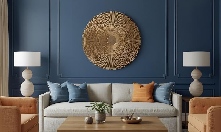
Sky Blue and Coral Combination
Pair soft sky blue with warm coral creating fresh energetic palette perfect for contemporary and transitional spaces. The complementary colors create vibrant cheerful atmosphere while maintaining sophistication. Use blue as dominant color with coral as accent through pillows, artwork, or accessories.
The unexpected combination feels modern and collected versus predictable matchy schemes. Include neutral elements—cream, white, natural wood—grounding bright colors and preventing overwhelming appearance. The warm-cool balance creates dynamic interesting spaces. Adjust proportions based on preference—more blue for calm, more coral for energy—customizing mood and atmosphere. The fresh palette works beautifully in sunny rooms embracing natural light and cheerful disposition.
Denim Blue Casual Comfort
Embrace relaxed denim-inspired blues creating approachable comfortable living spaces. Layer various denim shades from light chambray to dark indigo through textiles, artwork, and accessories. The familiar comfortable color feels instantly welcoming and livable.
Combine with worn leather, natural wood, and casual textures creating collected lived-in character. The approachable palette suits family-focused spaces prioritizing comfort and practicality. Include vintage elements and personal collections adding character and authenticity. The casual blue approach creates spaces encouraging actual living versus precious untouchable showrooms. Mix perfect and imperfect pieces creating genuine comfortable personality.
Peacock Blue Jewel Tones
Feature rich peacock or teal creating luxurious jewel-box atmosphere. The saturated elegant color adds glamour and drama. Pair with gold brass or copper metallics creating opulent sophisticated scheme. Include rich textures—velvet, silk, satin—enhancing luxurious feeling.
The bold color choice demonstrates design confidence and creates memorable spaces. Balance saturated blue with neutral elements preventing overwhelming sensory experience. Add pattern through accessories and textiles maintaining visual interest. The jewel-tone approach suits formal living rooms and sophisticated entertaining spaces. Include adequate lighting ensuring rich color displaying properly versus appearing muddy or dull.
Blue Abstract Art as Focal Point
Feature oversized abstract artwork dominated by blue tones creating instant focal point and color inspiration. Choose substantial piece measuring 48×60 inches minimum ensuring adequate presence. Pull accent colors from artwork—gray, white, gold—throughout room creating cohesive color story.
The art-first approach provides clear direction for entire room design. Position prominently above sofa or fireplace where size and color receive proper appreciation. The substantial investment delivers both decorative impact and design roadmap. Build room palette around artwork ensuring all elements supporting and complementing rather than competing. The art-focused strategy creates professionally designed cohesive appearance demonstrating thoughtful planning.
Styling Blue Successfully in Living Rooms
- Test Before Committing to Paint: Paint large sample boards viewing different times of day and lighting conditions. It’s like dress rehearsal preventing expensive mistakes. The preview ensures satisfaction with actual blue versus imagined ideal preventing disappointment after full application.
- Layer Multiple Blue Shades Creating Depth: Combine light, medium, and dark blues versus single flat tone. It’s like musical harmony where varied notes create richness. The tonal layering prevents monotonous boring appearance creating sophisticated dimensional schemes.
- Balance Cool Blue with Warm Elements: Include warm wood tones, brass metals, or warm neutrals. It’s like temperature regulation where balance creates comfort. The warm additions prevent cold uninviting spaces creating cozy welcoming environments.
- Consider Natural Light and Room Orientation: North-facing rooms need warm blues while south-facing spaces handle cool tones. It’s like climate dressing where conditions determine appropriate choices. The lighting consideration ensures blue reading beautifully versus appearing wrong or muddy.
Frequently Asked Questions About Blue Wall Decor Living Room
What Blue Works Best for Small Living Rooms?
Light powder blues, soft sky tones, or pale aqua make small spaces feel larger and more open. Darker blues can work if adequate natural light exists and paired with lighter furnishings preventing cramped heavy appearance.
Test samples ensuring adequate light for chosen shade. Avoid navy or deep blues in small dark rooms creating cave-like closed-in feelings versus airy expanded perception desired in compact spaces.
How Do You Mix Blue with Existing Neutral Furniture?
Blue complements virtually all neutrals beautifully. Gray furniture pairs perfectly with any blue shade. Beige works best with warmer blues avoiding cool gray-blues creating disconnected appearance.
Start with blue accessories—pillows, throws, artwork—gradually increasing blue presence as confidence grows. The flexible approach allows experimentation without permanent commitment building comfort with color incrementally over time.
Can You Use Blue in Dark Living Rooms?
Yes—choose warm-toned lighter blues avoiding cool gray-blues appearing muddy in insufficient light. Include substantial lighting—table lamps, floor lamps, sconces—ensuring adequate illumination throughout space preventing dull dingy appearance.
Consider blue through textiles and accessories rather than paint if lighting severely limited. The flexible approach introduces color without permanent commitment allowing adjustment if results disappoint in challenging lighting conditions.
What Colors Go Well with Blue Walls?
White, cream, gold, brass, coral, warm wood tones, and soft gray complement blue beautifully. Avoid matchy-matchy schemes mixing various complementary colors creating sophisticated layered appearance versus flat monochromatic monotony.
Include warm elements balancing cool blue creating comfortable inviting spaces. Test combinations through accessories before major furniture investments ensuring color relationships working harmoniously in specific space and lighting conditions.
Should Blue Walls Be Matte or Satin Finish?
Matte finishes create sophisticated modern appearance hiding wall imperfections while satin provides subtle sheen easier cleaning and maintaining. Living rooms typically use eggshell or satin balancing appearance with practicality.
Consider wall condition and maintenance preferences. Matte shows marks requiring touch-ups while satin wipes clean easily maintaining appearance longer. The finish choice affects maintenance and appearance warranting thoughtful consideration beyond pure aesthetics.
Transform Your Space with Beautiful Blue
Blue wall decor living room potential extends far beyond basic paint application. Strategic blue use—through artwork, textiles, furniture, or paint—creates calm sophisticated spaces with genuine personality and style. The versatile color suits any aesthetic from coastal to traditional, modern to eclectic creating beautiful livable environments.
Start small with blue accessories building confidence gradually. Test paint samples thoroughly ensuring proper shade selection. Layer various blue tones creating dimensional sophisticated schemes. Your beautiful blue living room awaits through confident thoughtful color introduction!
Which blue approach would transform your living room most beautifully? Share your blue decorating plans or favorite blue spaces below!