Your bedroom needs bold sophistication but red feels too aggressive and brown too dull. Burgundy sits perfectly at 0-10 degrees on the color wheel with 40-50% saturation—deep enough for drama, muted enough for livability. You want luxurious richness without overwhelming intensity or dated wine-cellar vibes.
Moody burgundy bedrooms deliver opulent drama with unexpected versatility when layered strategically. I’m covering 13 refined approaches from wine-colored accent walls and oxblood textiles to gold metallics and blush contrasts.
You’ll see which burgundy shades feel current, how deep reds stay sophisticated, what mistakes make burgundy look dated, and approaches creating jewel-box elegance instead of heavy darkness.
Why Moody Burgundy Bedrooms Command Attention
Perceived Value Increases Dramatically: Deep jewel tones like burgundy signal luxury and high-end design. The bold color choice communicates confidence and intentional curation elevating entire room’s perceived quality and sophistication.
Emotional Warmth Radiates Naturally: Burgundy’s red undertones create psychologically warm environments promoting coziness and intimacy. The enveloping warmth makes bedrooms feel like protective sanctuaries rather than sterile sleeping spaces.
Historical Elegance Endures Timelessly: Burgundy’s association with royalty, fine wines, and classic interiors ensures longevity. The color transcends trends maintaining sophisticated appeal across decades unlike fleeting fashionable shades.
Seasonal Versatility Spans Year-Round: Burgundy works equally well winter through summer when balanced properly. The richness feels cozy in cold months while jewel-tone quality prevents heaviness in warmer seasons.
Moody Burgundy Bedroom Ideas That Exude Dramatic Elegance
Create luxurious wine-toned retreats with these moody burgundy bedroom ideas featuring rich sophistication.
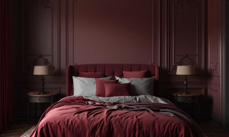
Wine-Colored Accent Wall Statement
Paint one wall deep burgundy or wine creating instant drama and luxurious focal points. The concentrated richness adds sophistication without overwhelming entire spaces. It’s like Bordeaux bottled where intensity focuses beautifully.
Sherwin Williams’ Rookwood Dark Red or Benjamin Moore’s Caliente delivers perfect wine depth. Keep adjacent walls neutral balancing richness. This moody burgundy bedroom foundation anchors designs with confident elegance.
Oxblood Velvet Upholstered Headboard
Install deep oxblood or burgundy velvet headboards adding sumptuous texture and focal drama. The plush fabric catches light creating movement and depth. It’s like thrones residential where luxury meets comfort.
Tufted or channel designs add architectural dimension and visual interest. Velvet’s sheen prevents burgundy from feeling flat or heavy. This moody burgundy bedroom centerpiece becomes stunning statement piece.
Gold And Brass Metallic Warmth
Incorporate antique gold light fixtures, brass hardware, or copper accents adding warm metallic luxury. The metals enhance burgundy’s warmth while adding sophisticated shimmer. It’s like gilded edges where metals elevate richness.
Brushed or antique finishes feel more organic than shiny polished versions. Layer warm metals throughout avoiding silver or chrome. This moody burgundy bedroom metallic layer adds essential glamorous warmth.
Blush Pink Softening Contrast
Balance deep burgundy with soft blush pink pillows, throws, or artwork creating unexpected sophisticated contrast. The tonal relationship feels harmonious while preventing overwhelming darkness. It’s like rosé alongside Merlot where family complements beautifully.
Use blush as 15-20% accent lightening heavy burgundy. The feminine touch prevents masculine heaviness. This moody burgundy bedroom pairing adds gentle sophisticated balance.
Charcoal Gray Grounding Anchors
Layer charcoal gray furniture, rugs, or accent pieces grounding burgundy’s warmth with sophisticated neutrality. The gray prevents burgundy from overwhelming while adding contemporary edge. It’s like shadows structured where darkness varies strategically.
Charcoal provides breathing room from burgundy’s intensity without competing. The combination feels modern and intentional. This moody burgundy bedroom anchor adds necessary weight and sophistication.
Cream And Ivory Breathing Room
Incorporate cream bedding, ivory curtains, or off-white trim preventing burgundy overload. The warm neutrals lighten spaces while harmonizing with red undertones. It’s like pearls against wine where lightness balances richness.
Keep 40-50% of room in light tones with burgundy comprising remaining percentage. Cream feels warmer than stark white complementing burgundy beautifully. This moody burgundy bedroom balance prevents oppressive heaviness.
Emerald Green Jewel Tone Pairing
Add emerald green plants, pillows, or accent furniture creating rich complementary harmony. The jewel tones together communicate luxury and intentional design. It’s like gemstones paired where richness multiplies beautifully.
Both colors’ depth creates sophisticated layering without competing. Use green as 15-25% accent maintaining burgundy dominance. This moody burgundy bedroom combination adds unexpected elegant complexity.
Terracotta And Rust Earth Tones
Layer terracotta pots, rust pillows, or burnt orange accents adding earthy warmth. The orange-red family creates natural tonal harmony. It’s like autumn permanent where warmth builds gradually.
Earth tones prevent burgundy from feeling too formal or precious. The organic elements add casual livability. This moody burgundy bedroom addition brings grounding natural warmth.
White Or Light Wood Furniture
Choose white painted, light oak, or natural maple furniture preventing overwhelming darkness. The lighter pieces provide essential visual relief and reflected light. It’s like marble against wine where contrast defines beautifully.
Avoid dark mahogany or walnut adding oppressive weight. Light furniture balances burgundy’s intensity. This moody burgundy bedroom furniture strategy maintains airiness despite deep walls.
Layered Burgundy Textiles Depth
Mix wine, burgundy, oxblood, and maroon textiles in varied textures creating tonal richness. The monochromatic layering feels intentionally luxurious rather than accidentally matchy. It’s like wine tasting visual where depth varies beautifully.
Combine velvet pillows, linen throws, smooth sateen sheets, and nubby wool blankets. Different textures prevent boring flatness. This moody burgundy bedroom layering builds sophisticated dimensional depth.
Oversized Brass Mirrors Reflecting
Hang large brass or gold-framed mirrors multiplying light and adding warm metallic statements. The reflection compensates for burgundy’s light absorption dramatically. It’s like doubling illumination where mirrors work strategically.
Position opposite windows or light sources maximizing natural light reflection. Ornate or simple frames both work depending on style. This moody burgundy bedroom trick brightens spaces while adding glamour.
Burgundy And Navy Color Blocking
Combine burgundy with navy blue creating sophisticated jewel-tone color blocking. The rich colors together feel regal and intentional. It’s like royal tapestries where depth layers magnificently.
Use burgundy and navy in equal proportions or 60-40 split. Both colors’ richness creates luxurious depth without overwhelming. This moody burgundy bedroom pairing adds unexpected dramatic sophistication.
Ambient Warm Lighting Layers
Install multiple warm-toned light sources—overhead, bedside lamps, wall sconces, floor lamps—creating essential layered illumination. Burgundy absorbs significant light requiring compensation. It’s like candlelight multiplied where warmth glows everywhere.
Use 2700K warm bulbs enhancing burgundy’s richness. Dimmers provide flexibility from functional to romantic. This moody burgundy bedroom lighting strategy makes deep colors livable and inviting.
Common Moody Burgundy Bedroom Mistakes And Solutions
Painting All Walls Burgundy Overwhelming
Four burgundy walls create oppressive wine-cellar darkness lacking relief or visual breathing room.
Solution: Paint single accent wall burgundy with remaining walls in cream, soft white, or warm greige. Concentrated drama provides impact while maintaining livability. Strategic placement prevents overwhelming heaviness.
Pairing With Dark Woods Looking Dated
Mahogany or dark cherry furniture against burgundy reads 1990s formal dining creating aged appearances.
Solution: Choose light woods like oak or maple, white painted furniture, or brass/glass pieces providing contrast. Light furniture modernizes burgundy preventing traditional dated associations. Contemporary lines update classic color.
Using Cool Metals Creating Discord
Silver, chrome, or pewter metals clash with burgundy’s warm undertones creating uncomfortable visual tension.
Solution: Use exclusively warm metals—antique gold, brass, copper, or rose gold—harmonizing with burgundy’s warmth. Consistent warm metallics create cohesive elegant atmospheres. Temperature matching matters significantly.
Insufficient Lighting Causing Gloom
Burgundy absorbs light significantly so minimal lighting creates unusably dark depressing spaces.
Solution: Install minimum five warm light sources at various heights creating layered illumination. Use warm 2700-3000K bulbs with dimmers. Multiple sources compensate for burgundy’s light absorption preventing cave-like darkness.
Adding Too Many Reds Overwhelming
Burgundy plus bright red plus pink creates chaotic overwhelming red overload lacking sophistication.
Solution: Limit red family to two tones—burgundy plus blush or burgundy plus terracotta. Balance with neutrals and one non-red accent like emerald or charcoal. Restraint creates elegance.
Frequently Asked Questions About Moody Burgundy Bedrooms
What Burgundy Shades Work Best Bedrooms?
Deep wine burgundies with slight warmth work beautifully—avoid brown-burgundies looking muddy or bright burgundies feeling aggressive. Sherwin Williams’ Rookwood Dark Red (SW 2802),
Benjamin Moore’s Caliente (AF-290), or Farrow & Ball’s Eating Room Red (43) offer sophisticated jewel-tone depth. These shades balance richness with livability avoiding overwhelming intensity or dated associations.
How Do You Keep Burgundy From Looking Dated?
Burgundy reads contemporary when paired with modern elements—clean-lined furniture, geometric patterns, brass metals, and unexpected accents like blush or emerald.
Avoid traditional pairings with dark woods, heavy damasks, or gold brocades reading formal and aged. Mix vintage and modern pieces, incorporate contemporary art, and choose streamlined furniture preventing single-era dating.
Can You Mix Burgundy With Other Colors?
Burgundy pairs beautifully with blush pink (tonal harmony), emerald green (complementary richness), charcoal gray (sophisticated grounding), cream/ivory (soft contrast), navy blue (jewel-tone depth), or terracotta (earthy warmth).
Limit to three colors beyond burgundy preventing chaos. Warm tones and jewel tones harmonize best while cool colors or neons clash.
Creating Your Moody Burgundy Retreat
Moody burgundy bedroom ideas prove wine tones create luxurious dramatic sanctuaries when balanced thoughtfully.
Use burgundy strategically on accent walls or textiles not entire rooms, pair with warm metals and light furniture preventing dated heaviness, and install abundant warm lighting compensating for light absorption.
Avoid all-burgundy schemes or traditional dark wood pairings creating oppressive outdated spaces instead of jewel-box elegance.
Which moody burgundy element inspires you most? Share your rich bedroom transformation plans below!