Your wall shelves probably sit there looking awkward—random books stacked unevenly, a lonely candle nobody ever lights, maybe some dusty picture frames facing slightly wrong directions, and overall that “I stuck stuff on shelves but have no idea what I’m doing” vibe that screams decorating afterthought instead of intentional design feature worth the wall space they’re occupying.
Wall shelf decor living room styling isn’t about randomly filling empty horizontal surfaces with whatever fits—it’s understanding height variation principles, color repetition strategies, negative space importance, and layering techniques that transform functional storage into curated displays looking effortlessly collected rather than desperately cluttered or disappointingly bare without clear direction or purpose.
We’re covering 10 wall shelf decor living room ideas featuring proven styling formulas, practical arrangement principles, common mistake solutions, and step-by-step approaches that work across shelf types and room styles creating displays that finally make your shelves look like they belong in magazine spreads instead of “before” photos on home improvement shows.
Why Shelf Styling Feels So Challenging
- Balance Requires Multiple Elements Working Together: Successful displays need varied heights, repeated colors, textural contrast, and negative space working simultaneously creating complexity most people underestimate. It’s like juggling where coordinating multiple moving parts determines success. The multi-variable challenge explains why random attempts fail consistently despite good individual pieces.
- Too Much Looks Cluttered, Too Little Looks Unfinished: Finding the Goldilocks zone between sparse and stuffed challenges even experienced decorators requiring careful editing and restraint. It’s like seasoning food where balance matters critically. The delicate equilibrium separates professional-looking displays from obvious amateur attempts.
- Personal Items Need Elevated Presentation: Family photos, travel souvenirs, and sentimental objects require thoughtful styling preventing precious memories looking like garage sale leftovers. It’s like food plating where presentation affects perception dramatically. The elevated approach honors meaningful items through proper display techniques.
- Cohesion Without Monotony Requires Planning: Creating unified appearance while maintaining visual interest demands intentional color repetition, varied shapes, and strategic placement. It’s like outfit coordination where relationships matter more than individual pieces. The holistic thinking creates displays reading as complete compositions.
10 Wall Shelf Decor Living Room Ideas
Master shelf styling with these wall shelf decor living room ideas featuring proven arrangement principles and practical approaches.
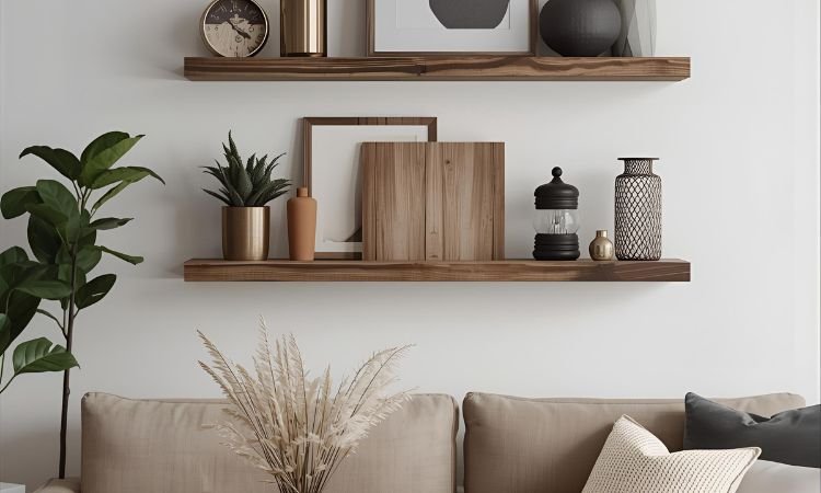
The Triangular Height Arrangement
Create visual interest by arranging objects in triangular formations using varied heights—tall vase left, medium frame center-back, low bowl right. The geometric principle guides eye movement and creates balanced asymmetry preventing flat boring horizontal lines. Repeat triangular groupings across multiple shelves maintaining rhythmic pattern throughout display.
Include objects spanning 6-18 inch height range creating adequate variation and dimensional interest. Overlap items slightly creating depth versus rigid single-plane arrangement. The triangular formula provides foolproof starting point for beginners eliminating guesswork and creating immediate visual improvement. Practice seeing triangular shapes within arrangements naturally improving styling intuition and confidence over time through repeated successful applications.
Books as Foundational Anchors
Use books as building blocks creating height variation, adding color blocks, and providing stable platforms elevating smaller objects. Stack 2-4 books horizontally creating pedestals, arrange vertically as bookends, or mix orientations creating visual rhythm. Choose book covers coordinating with room palette or wrap in neutral kraft paper creating cohesive appearance.
Position books throughout shelves providing structure and weight anchoring lighter decorative objects. The substantial presence grounds displays preventing floaty insubstantial appearance common with only small lightweight items. Include varied book sizes creating different platform heights and visual interest. The functional beautiful approach celebrates reading while providing practical styling foundation supporting entire display composition successfully.
The Rule of Threes
Arrange decorative objects in odd-numbered groupings—typically three items per cluster—creating naturally pleasing compositions. Group candlesticks in graduated heights, cluster vases in varied sizes, or arrange frames in three-piece sets. The odd numbers prevent symmetrical stiffness while creating enough visual weight for impact.
Vary the three items through height, color, or texture preventing identical triplets looking too matchy. Position grouped items with slight overlapping versus rigidly separated maintaining cohesive cluster appearance. Repeat three-item groupings across shelves creating rhythmic pattern throughout display. The simple formula works reliably across styles and objects providing accessible styling principle requiring no design degree applying successfully.
Layered Frame and Object Combinations
Layer frames leaning against wall with smaller objects positioned in front creating dimensional depth and casual collected appearance. Position larger frames behind, medium objects mid-ground, smallest items front creating forced perspective and visual complexity. Overlap elements slightly preventing rigid separation and creating integrated composition.
The layered approach adds substantial visual interest using vertical dimension versus flat single-plane arrangements. Include varied frame sizes—8×10 to 16×20 inches—creating height diversity and preventing monotonous uniform appearance. Lean frames confidently at slight angle ensuring stability while maintaining casual intentional positioning. The sophisticated technique creates professionally styled appearance demonstrating design understanding and confident execution.
Color Repetition Throughout Display
Choose 2-3 accent colors repeating throughout shelves creating visual cohesion and intentional curated appearance. If using navy and brass, ensure both colors appear on multiple shelves through varied objects creating connected storyline. The repetition creates unity within variety preventing random disconnected collections looking accidentally assembled.
Include accent colors through books, frames, decorative objects, plants, and vessels distributing consistently throughout display. Maintain neutral foundation—white, cream, natural wood—allowing accent colors popping without overwhelming. The color discipline demonstrates intentional curation and design sophistication elevating displays from random collections to cohesive compositions. Adjust seasonal accessories introducing new accent colors refreshing displays without complete overhauls.
Living Greenery Integration
Include plants and greenery adding life, organic shapes, and color contrast softening hard surfaces and structured objects. Trailing varieties—pothos, string of pearls—cascade beautifully from shelves adding vertical movement. Upright plants in varied heights create living sculptural elements. Mix real and quality faux plants balancing maintenance with full coverage.
Position plants throughout shelves preventing clustering all greenery single location. The organic elements soften geometric objects and add essential life and freshness to displays. Choose containers coordinating with overall color scheme—ceramic, woven baskets, simple pots—maintaining cohesive aesthetic. The natural additions create balanced displays preventing overly staged sterile appearance while adding essential organic warmth and movement.
Negative Space as Design Element
Leave intentional empty space between groupings allowing eye resting and preventing overwhelming cluttered appearance. Aim for approximately one-third shelf space remaining empty creating breathing room and sophisticated restraint. The negative space allows individual objects proper appreciation versus competing within crowded chaos.
Resist temptation filling every inch treating emptiness as failure versus intentional sophisticated design choice. The strategic space demonstrates confidence and curatorial discipline separating professional displays from amateur over-stuffed attempts. Position empty areas deliberately between groupings creating clear visual breaks and organized composed appearance demonstrating thoughtful planning and restraint.
Textural Variety and Contrast
Mix smooth ceramics with rough woven baskets, shiny metallics with matte finishes, sleek glass with organic wood creating tactile and visual interest. The varied surfaces prevent monotonous single-material displays lacking dimension and sophistication. Include minimum three different textures per shelf creating adequate variety without overwhelming confusion.
The textural diversity adds sophistication and depth engaging viewers through varied surfaces and finishes. Consider how light interacts differently with glossy versus matte objects creating additional visual interest through reflection and absorption. The material mixing demonstrates design understanding and creates professionally styled appearance transcending basic object arrangement into genuine compositional artistry.
Functional Items as Beautiful Objects
Display everyday items—decorative boxes holding remotes, beautiful bowls containing keys, attractive baskets storing throw blankets—combining beauty with utility. The dual-purpose approach maximizes shelf functionality while maintaining styled appearance. Choose attractive versions of necessary items versus hiding everything creating overly precious untouchable displays.
Position functional pieces thoughtfully within overall composition treating as legitimate decorative elements versus necessary evils. The practical beautiful balance creates livable styled spaces versus museum-like perfection preventing actual room use. Include items you actually need and use regularly ensuring shelves serving genuine purpose beyond pure decoration creating authentic lived-in character.
Seasonal Refresh Strategy
Rotate approximately 30% of shelf contents seasonally introducing fresh colors, relevant objects, and timely themes maintaining display interest without complete overhauls. Swap spring florals for autumn pumpkins, winter greenery for summer coral, maintaining foundational pieces while refreshing accents keeping displays current and interesting.
The partial rotation approach keeps displays feeling fresh without exhausting complete restyling requiring significant time and energy. Store seasonal items in labeled bins enabling quick efficient swaps. The strategic refresh demonstrates active curation and prevents stale unchanged displays becoming invisible through over-familiarity. Photograph successful arrangements guiding future restyling and documenting proven formulas for repeated success.
Mastering Shelf Styling Techniques
- Start With Largest Items First: Position substantial pieces establishing scale and foundation before filling with smaller accessories preventing overcrowding and ensuring proper visual weight distribution. It’s like building construction where foundation precedes finishing details. The sequential approach prevents overwhelming arrangements and ensures proper proportions.
- Step Back Frequently Evaluating: View shelves from typical sitting and standing positions assessing overall appearance versus close-up details ensuring display reading properly from actual viewing distances. It’s like photography composition where perspective matters critically. The distance evaluation prevents arrangements working up-close but failing from practical viewing positions.
- Edit Ruthlessly Removing Excess: Remove 20-30% of initially styled items creating breathing room and eliminating visual clutter demonstrating curatorial discipline and confidence. It’s like writing editing where cutting strengthens remaining content. The subtraction often improves displays more than addition creating sophisticated restrained appearance.
- Photograph Successful Arrangements: Document arrangements you love providing reference for future restyling and capturing proven formulas worth repeating preventing starting from scratch each refresh. It’s like recipe collection where successful formulas deserve preservation. The photographic record enables consistent quality and prevents forgetting successful combinations.
Frequently Asked Questions About Wall Shelf Decor Living Room
How Many Items Should Go On Shelves?
Aim for 3-5 items or groupings per shelf maintaining adequate negative space. Floating shelves handle less—2-3 items—while built-in units accommodate more through varied depth and height creating multiple display planes.
Prioritize visual balance over specific counts adjusting based on object sizes and shelf dimensions. Leave approximately one-third space empty creating breathing room and sophisticated restraint preventing overwhelming cluttered appearance.
What Should You Put On Living Room Shelves?
Combine books, decorative objects, plants, frames, and personal items creating varied interesting displays. Include varied heights, textures, and colors creating visual diversity and preventing monotonous single-category collections.
Balance meaningful personal items with purely decorative pieces creating displays honoring memories while maintaining aesthetic cohesion. Avoid purely functional storage items lacking decorative merit relegating those to hidden storage solutions.
How Do You Style Shelves Without Looking Cluttered?
Maintain negative space leaving one-third shelves empty allowing eye resting. Group items in organized clusters versus scattering randomly throughout. Limit color palette using 2-3 accent colors plus neutrals creating cohesion.
Edit ruthlessly removing marginal items strengthening remaining displays. Use books and larger objects creating structure and anchoring lighter pieces. The disciplined restrained approach creates sophisticated curated appearance versus overwhelming collections.
Should Shelf Items Match Room Decor?
Coordinate through repeated colors, complementary styles, and harmonious materials rather than exact matching. Include room accent colors within shelf displays creating visual connections throughout space establishing cohesive unified design.
Avoid perfectly matched sets looking too coordinated and sterile. The thoughtful coordination versus rigid matching creates professionally styled appearance demonstrating sophisticated design understanding and intentional curation throughout entire room.
How Often Should You Restyle Shelves?
Refresh seasonally rotating approximately 30% of contents introducing new colors and relevant items maintaining interest without exhausting complete overhauls. Adjust when displays feel stale or after room updates requiring coordination.
Complete restyling every 1-2 years prevents stagnant unchanging displays becoming invisible through over-familiarity. The regular rotation demonstrates active curation and keeps spaces feeling fresh and intentionally maintained versus neglected and forgotten.
Transform Your Shelves Into Styled Features
Wall shelf decor living room success requires understanding proven styling principles—varied heights, color repetition, textural contrast, negative space—creating displays demonstrating intentional curation and design sophistication. The strategic approaches transform empty shelves into styled statements anchoring rooms and showcasing treasured items within beautiful cohesive compositions worthy of prominent display.
Start with substantial foundational pieces establishing scale and structure. Layer smaller objects creating depth and visual interest. Edit ruthlessly maintaining breathing room and sophisticated restraint. Your beautifully styled shelves await through patient thoughtful curation and proven arrangement principles!
Which shelf styling principle would transform your displays most dramatically? Share your styling challenges or successful arrangements below!